Business Websites
Your Website Looks Good, But Is It Actually Bringing You Customers?
Your website can look great and still lose customers. Here are the common problems I look for as a developer and what businesses can do to fix them.

· 8 min read
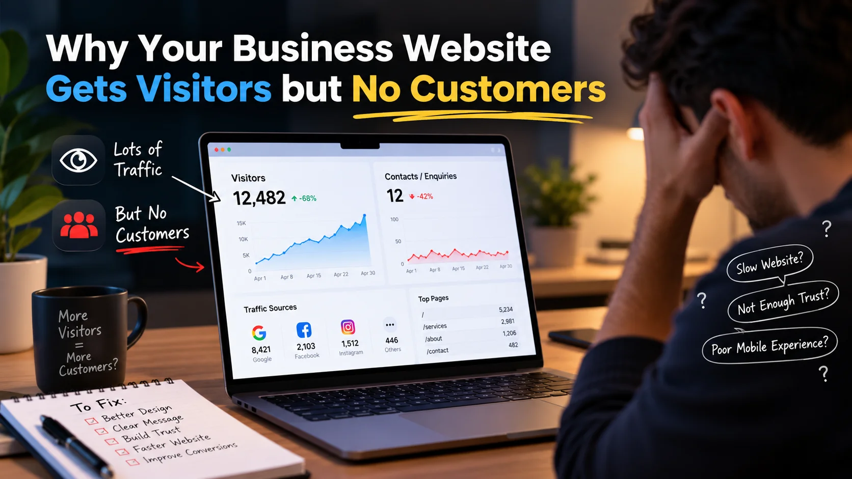
You paid for a website.
It looks professional. Your services are there. Your contact details are there. Maybe you're even getting visitors from Google, Facebook, Instagram, or ads.
But there's one problem.
People visit the website and leave without contacting you.
I see this problem a lot when looking at business websites.
And usually, the problem isn't that the website needs more animations, more colors, or a complete redesign.
Sometimes the website simply isn't answering the questions a potential customer has before deciding to trust the business.
As a web developer, I've started looking at websites differently because of this.
A website can be technically good and still be bad at doing its actual job.
So here are some of the things I would check first.
1. Your homepage doesn't immediately explain what you do
Imagine finding a company through Google.
You open their website and the first thing you see is:
Building Excellence Through Innovation
Sounds nice.
But what does the company actually do?
Do they build houses? Develop software? Sell machinery? Provide consulting?
I shouldn't have to scroll through half of the website to figure that out.
A good homepage should answer three basic questions very quickly:
Who are you?
What do you offer?
What should I do next?
For example, instead of:
Transforming Your Digital Future
a web agency could say:
We design and develop websites for restaurants and local businesses in Kuala Lumpur.
It's less fancy.
But I immediately understand the business.
And personally, I think clarity is more valuable than trying to sound impressive.
2. Your website is talking too much about you
This sounds strange because obviously a business website needs to talk about the business.
But there is a difference between:
We have 10 years of experience and use modern technologies.
and:
Get a fast, mobile-friendly website that makes it easy for customers to find your services and contact you.
The first sentence is about the company.
The second one explains what the customer gets.
When someone visits a business website, they are usually thinking:
Can this company solve my problem?
That's why I like service pages that focus on outcomes first and company details second.
Your experience, certifications and technology still matter.
They just need context.
3. Your website looks untrustworthy
Let's say two companies offer almost exactly the same service.
Company A has:
- a clean website
- real business information
- customer reviews
- completed projects
- clear contact details
- professional photos
- an active social presence
Company B has:
- a generic template
- stock photos everywhere
- no real projects
- no reviews
- broken pages
- only a WhatsApp number
Which one would you contact first?
Probably Company A.
That's the interesting thing about websites.
Design isn't only about making something beautiful. Design also affects trust.
Small things can make visitors question a business.
An expired copyright year.
A broken image.
A Gmail address instead of a business email.
Fake-looking reviews.
Pages that don't work properly on mobile.
Social media icons that lead nowhere.
None of these things individually destroys a business.
But together, they can make someone hesitate.
And online, hesitation often means pressing the Back button.
4. Your website is too slow
This is one of the first technical things I look at.
A beautiful homepage isn't very useful if visitors are staring at a loading screen.
Large images are often one of the biggest problems.
I've seen websites upload a 4–8 MB image just to display it as a small banner.
That's unnecessary.
Depending on the project, I normally look at things such as:
- image compression
- modern image formats
- lazy loading
- JavaScript bundle size
- unnecessary third-party scripts
- fonts
- caching
- server response time
- layout shifts
You don't need a perfect performance score just for bragging rights.
The actual goal is simple:
Don't make your customer wait unnecessarily.
Especially on mobile data.
5. The mobile version was treated as an afterthought
Open your website on your phone right now.
Don't just check whether it technically opens.
Try to use it like a customer.
Can you understand the business without zooming?
Can you tap the buttons comfortably?
Can you find the phone number?
Can you navigate the menu?
Can you fill out the contact form?
Can you read the text without fighting with popups?
Sometimes a desktop website looks amazing while the mobile version feels completely different.
That's a serious problem because many potential customers will discover a business from their phones.
Responsive design shouldn't mean:
Everything technically fits on the screen.
It should mean:
The website is actually comfortable to use on this screen.
There's a big difference.
6. There is no obvious next step
Let's say I like your service.
What should I do?
Some websites strangely make this difficult.
The visitor reaches the bottom of the page and... that's it.
No clear action.
A business website normally needs an obvious next step.
Depending on the business, that might be:
Request a Quote
Book an Appointment
Call Now
Message on WhatsApp
Schedule a Consultation
View Our Services
Start Your Project
The important part is that the action matches what the visitor is ready to do.
I also wouldn't put ten different calls to action beside each other.
If everything is important, nothing feels important.
7. Your contact form is asking for too much
I've seen contact forms that basically feel like applying for a mortgage.
Name.
Email.
Phone.
Company.
Company size.
Industry.
Address.
Budget.
Deadline.
Project type.
How did you find us?
Detailed description.
And five more questions.
Sometimes all of that information is genuinely needed.
But for the first conversation?
Probably not.
Every additional field gives someone another opportunity to say:
I'll do this later.
And “later” often means never.
For many businesses, something simple like:
Name + Email/Phone + What do you need help with?
is enough to start the conversation.
You can collect the rest later.
8. You have services, but no proof
Anyone can write:
We provide high-quality professional services.
Why should a visitor believe it?
This is where projects, testimonials, case studies and real results become useful.
For developers, this is exactly why I prefer showing actual projects instead of simply writing:
I know React, Next.js and Firebase.
A real project allows someone to see what I actually built.
The same principle works for almost any business.
If you're a renovation company, show completed renovations.
If you're a restaurant, show your actual food and restaurant.
If you're a designer, show your designs.
If you're an agency, explain the problems you've solved.
Show evidence instead of only making claims.
9. Your website was built for Google instead of humans
SEO matters.
I care about SEO on the websites I build.
But sometimes businesses take it too far.
You open a page and see something like:
Best web developer Malaysia providing best web development Malaysia for businesses looking for professional web developer Malaysia...
Nobody talks like that.
And nobody enjoys reading it.
Search engines need to understand your page, but the person reading the page is still a human.
Good SEO and good writing shouldn't be enemies.
You can naturally explain:
- what you do
- where you operate
- who you help
- what problems you solve
- why your service is useful
without repeating the same keyword twenty times.
I would rather create a genuinely useful page that answers someone's questions than a page obviously written only to rank.
10. You're sending every visitor to the homepage
This is something I think businesses should consider more often.
Suppose you run a company offering:
- website development
- SEO
- social media marketing
- e-commerce development
Someone searches specifically for:
e-commerce website developer
Why send them to a generic homepage where they need to find the e-commerce information themselves?
A dedicated service page can explain exactly what they searched for.
For example:
/services/ecommerce-development
That page can contain relevant information about:
- the service
- the process
- previous work
- common questions
- pricing approach
- contact options
The visitor gets a much more relevant experience.
And search engines get a clearer understanding of what the page is about.
11. Your website doesn't answer objections
Before contacting a business, people usually have questions.
How much does it cost?
How long does it take?
Do you work with small businesses?
Can you customize the service?
What happens after I pay?
Do you provide support?
Can I see previous work?
What technologies do you use?
Do I own the final website?
If customers repeatedly ask the same questions, your website should probably answer some of them.
A useful FAQ section can remove uncertainty before the visitor ever contacts you.
That's valuable for both the business and the customer.
12. You're measuring traffic instead of results
Getting 10,000 visitors sounds great.
But what if none of them become customers?
Meanwhile, another website gets 500 relevant visitors and generates 20 enquiries.
Which website is performing better?
Traffic alone doesn't tell the whole story.
For a business website, I would pay attention to actions such as:
- contact form submissions
- phone clicks
- WhatsApp clicks
- appointment bookings
- quote requests
- purchases
- important service-page visits
This helps answer a much more useful question:
Is the website helping the business?
What I Look at When Reviewing a Business Website
When I'm looking at a website from a developer's perspective, I don't start by asking:
Does this website have enough animations?
I usually start with questions like:
Can I immediately understand the business?
Does it work properly on mobile?
Does it load quickly?
Does the website feel trustworthy?
Can Google understand the important pages?
Is navigation simple?
Is there a clear next action?
Are there real examples of the company's work?
Is contacting the business easy?
Does the website actually help turn visitors into enquiries or customers?
A website doesn't necessarily need to be complicated to do these things well.
In many cases, simplicity works better.
A Website Is Not Just an Online Business Card
This is probably the biggest point I want to make.
A lot of businesses build a website because they feel like they are supposed to have one.
The website gets published.
Then nobody thinks about it again for three years.
I think that's a missed opportunity.
Your website can be the place where someone discovers your business, understands what you offer, compares you with competitors, sees your previous work, gets answers to their questions and finally decides to contact you.
That's much more valuable than simply having your logo and phone number online.
And sometimes improving the website doesn't mean rebuilding everything.
A clearer headline, better service page, faster images, stronger proof, simpler contact form or better mobile experience can already make a meaningful difference.
If your website is getting visitors but not generating enquiries, don't immediately assume you need more traffic.
First ask:
What happens after people arrive?
That question can reveal much more.
I'm Ehan Siddique, a full-stack web developer. I write about web development, the projects I'm building, and practical lessons I've learned while working with modern websites and applications.
You can explore my other articles and development projects here on my website.
- #Web Development
- #Business Website
- #SEO
- #Website Performance
- #Conversion Optimization
- #User Experience
- #Small Business

Written by
Ehan Siddique
MERN Stack Developer & Digital Marketer from Tangail, Bangladesh, with 7+ years of experience building fast, SEO-optimized websites for 300+ clients worldwide.